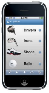
 If you haven’t already made your company’s website mobile friendly then that is something you need to get on. It’s important that your company has a regular website and a mobile site. People are using their phones so much more to research things and when they go to a site that’s hard to read or you have to keep adjusting they are most likely to go somewhere else. The beauty of mobile sites is that you can put all your most important information up top and everything is legible. People don’t have to worry about adjusting the size of the screen constantly. Other difference between website and mobile sites are:
- The biggest difference is the size. For a computer you will be designing for a 1024 x 768 screen resolution and for mobile you will be designing for a 320 x 480 screen resolution. So, on mobile it’s very important that you put your most valuable information on the top of the site where it’s easy to find and read.
- Your navigation will be vertical for mobile opposed to how it’s horizontal for most websites.
- Mobile sites are going to have less graphics because not all phones can upload the same images as the website. It’s important to have the company’s logo and make sure to incorporate the brand colors for consistency purposes.
- Hypertext is the signature component of the Internet, but on mobile sites there are few or no hypertexts on pages.
- Mobile sites take advantage of technology and can automatically detect where users are to present local search results.
As you can see there are many differences between mobile sites versus websites. It’s important to pick a designer/team that knows the difference, so that you can present your company in the best way possible. Does your company have a mobile site? If so, what is it?
Photo courtesy of flickr


